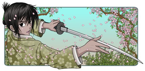
In case you're wondering, I was fond of the old cover, since it seemed to express at least one dimension of the passions I think Emily Kane experiences in Book #1. But other elements of the cover didn't seem to me to fit as well. She wears too much make-up, and seems too socially self-assured, and mainly displays anger and resentment.
By contrast, the new cover seems to me to express those passions and others better. In particular, beyond merely exhibiting anger, this image shows her insecurities and her resolve. That's how I tend to think of Emily, a girl who wishes for friends, and worries about her identity, traits she shares with just about every teenager who's ever lived. But she's different, too, full of confidence in one aspect of her life, but also worried about the implications of her vast abilities in the martial arts.
One last thing it shows is the depth of the darkness of her eyes, which the old cover lacked.


No comments:
Post a Comment