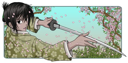

The central image is taken from a photograph by Angelo Colucci, who has generously given his time to help me with this project. I found a version of this image on Flickr and was immediately struck by the combination of weariness and resoluteness it expressed. Emily Kane is a reluctant warrior. She doesn't take up her sword lightly, but once she begins to fight, she finishes what others have started. The girl in the image holds her sword with a combination strength and weariness: strength enough to hold the sword in one hand, weariness visible in the way the jacket hangs off her shoulder. She looks out the blank windows, as if she's just finished one battle and wonders whether she'll have to fight another.

I like both! I know that is not very helpful ... but maybe the colour one pops a bit more?
ReplyDeleteThanks, Meghan.
ReplyDeleteI've been thinking of making the black one more colorful in the image. I originally wanted it to be stark. Second thoughts, you know.